Prima Foosiripong

MANGAVERSE
UX/UI Design
a manga-reading application that aims to bring users along with the new immersive ADVENTURE in every manga they read and on every page they turn—access manga around the world from anywhere with the internet.
ROLE:
UX/UI Designer
TEAM SIZE:
3 person
DURATION:
4 months
SOFTWARE USED:
Figma, Canva
WHY MANGA?
As a team of game designers and artists, manga is a significant inspiration that led us to in this major. This led us to choose to create a UX/UI project for a manga application called "Mangaverse."

FEATURES
Seamless Manga Reading mimic from real life experience

Dark mode for reducing eyes strain.
Express Yourself through your profile

Connect with other!
RESEARCH
User interview
In this research, my team interviewed 51 fellow manga readers about their experiences with various manga reading applications. We carried out the interviews, took notes, and used Google Forms to efficiently organize the data.
General Information


Behavior


From the result of the data, it shows that most of the respondents read manga at 16:00 - 20:00 according to the data we have, 66.7% of respondents choose to read manga at that time. The platform they use the most is webtoon, which 82% of respondents are familiar with. 35.3% of respondents read manga every day. The device that the majority of respondents use to read manga is a mobile phone, according to the data, 74.5% of respondents read manga on mobile phones. 66.7% of respondents dislike ads that are too frequent on manga platforms. 36.1% of respondents spend 1- 100 baths on manga per month.
Preference & Challenge

We selected both webtoon and manga reader platforms as our different platforms because Thai people are more familiar with webtoons applications compared to manga reader applications. This allowed us to utilize the information from a similar platform and apply it to our manga reader application.

PERSONA
To categorize personas, first, we look at how often respondents read manga per week, mainly two major groups have been examined, the group of respondents that read manga frequently and the group that read manga a few times per week. We choose the primary persona from the most common trait in the reader that frequently read manga, then we studied other group preferences to categorize them further.
For primary personas, mostly they are high school and college students between 17-25 years old who like to read manga at 16:00 - 24:00 on their mobile phones to relax. Their favorite platform is Webtoon and Comico. They choose to read manga based on the story. They spend money on manga from 1-100 baht per month. They dislike too frequent ads and no dark mode on manga reader platforms because they read manga at night.


As for secondary personas, mostly they are adults more than 25 years old, They read from 20:00-4:00. They read manga on their PC and paper to relax. Their favorite platform is Manga Plus. They choose to read manga based on recommendations. They usually spend money on manga 101 - 500 per month.
They dislike manga platform that doesn't have dark mode and too many ads.


As for Tertiary personas, mostly they are middle school students younger than 15 years old, They read from 12:00 - 20:00. They read manga on their tablets and mobile phone for fun. Their favorite platform is Webtoon and Comico. They choose to read manga based on art.
They dislike too-expensive manga because they don't have enough money.


ANALYZING
Utilizing insights from the three persona, focusing on their pain point and behavior patterns, I established 3 design goals for Mangaverse.
Immersive Experience
Mimic the experience of reading a real manga and avoid disturb the reading flow to create an ideal experience.
Reduce Eye Strain
The first and second persona mostly read manga at night for a long time, which may lead to faster eye strain.
Community Building
Create a space for community of each manga to encourage the reader to continue reading to have a meaningful conversation.
DESIGN
"First, for the mutual understanding between the 3 members of the overall theme, we start at Style guide"
Moodboard

COLOR PALETTE
Our color palette was chosen based on the emotions and themes that we want to convey through the application. Dark blue represents tiredness from work or study, while orange symbolizes joy, which will be the primary color of our application. Finally, yellow represents friendship.
MOODBOARD ARRANGEMENT
The placement of images on the mood board is based on the intended user journey and the emotions we want to evoke. The left side starts with dark blue representing tiredness from work or study, followed by lighter images in variance orange tones that convey a sense of escape and enjoyment from reading manga. The right side ends with yellow representing friendship, which aligns with the user's desire to share their manga experiences with friends.
TYPOGRAPHY
-
We want our users to feel excited every time they open a new page like they are going on a new adventure.
-
We want our users to be able to use our manga reading application to escape reality.
-
The chosen font, Mitr, is a friendly and casual font that promotes readability while maintaining a sense of approachability.

Style Guide


Screen Information


Low-
Fidelity
Wireframe

"Second, we start brainstorming about the intended user experience that cater with our target persona using the design goal"
Immersive Experience
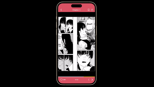
For this design goal, we mimic the manga reading experience from left to right, and make the transition between 2 chapter similar to page swapping to not distract the reading flow, even when the chapter is finished.
Reduce Eye Strain
We add dark mode to reduce the light density for better adjustment in the low light environment, and add the option to adjust text size to the user's preference for increasing readability

Community Building
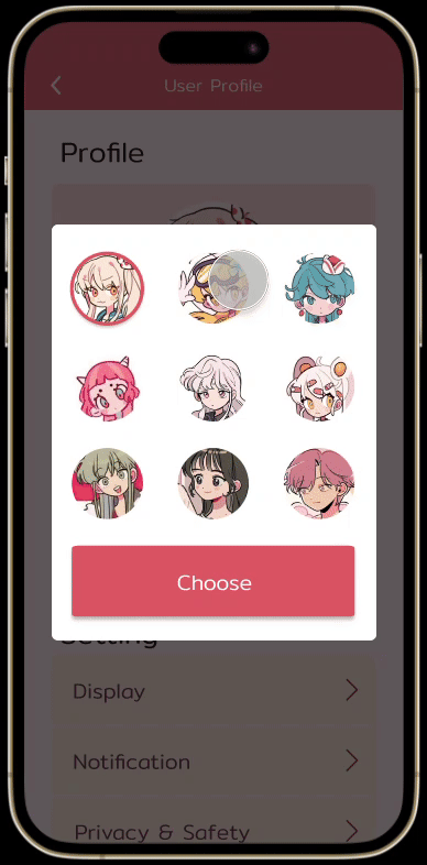
We add the comment section to encourage the user to communicate with each other about their favorite manga, build a strong bond to the application and create a sense of community.
We also add a feature to change their profile picture and name for the better expression of user.

GUERRILLA TESTING


REFLECTION
Key Takeaway
Accessibility Matter
During the test of Mangaverse's high-fidelity prototype, there are complaint about our accessibility, which make some of the unrecorded tester quit testing during the session.
By including options for enhancing accessibility, the application is ensure to be user-friendly toward the one who need them.
Take advantage of data organization
For the guerrilla testing, we have collect the data of each participant by paper, which make the analyzing process unnecessary harder due to we need to manual entering the gathered data.
By using the organization tool such as google form, the data will be more organize and easier for further development
Obstacle
Small Time Frame
We made Mangaverse in 4 months, which is a very small time frame consider we also have assignments from other class, so we need to crunch at the end of the semester to get it done.
But I have learn how to make a UX/UI project and its process, which combine with the key takeaway, I will have a better understanding of what I need to do to avoid crunch in the next project of mine.
Learn the quality of life tool
Figma have a feature to make each component easier to tracked. As in Mangaverse, there is several reused asset, we should utilize the tool for easier fix, but unfortunately, we did not learn this until the end of semester, which lead us to doing the repetitive task and waste our time.
By learning about these tools beforehand, we can use them to our advantage and have a better usage of our time.